The brief
A studio website should communicate an approach while explaining the work it takes on. It needs to document real projects clearly, beyond a sequence of attractive pictures.
Web design concept / Fictional brand
An editorial direction for an architecture and interiors studio. A small set of elements, generous spacing and clear project information keep the work central.
01 / Before the first pixel
A studio website should communicate an approach while explaining the work it takes on. It needs to document real projects clearly, beyond a sequence of attractive pictures.
Private clients and commercial commissioners need to recognise the studio’s approach, relevant experience and a straightforward first contact.
Projects, studio, services and contact form a useful structure. Project pages could follow brief, design and delivery; filters only become useful with a larger collection.
The proposed homepage structure
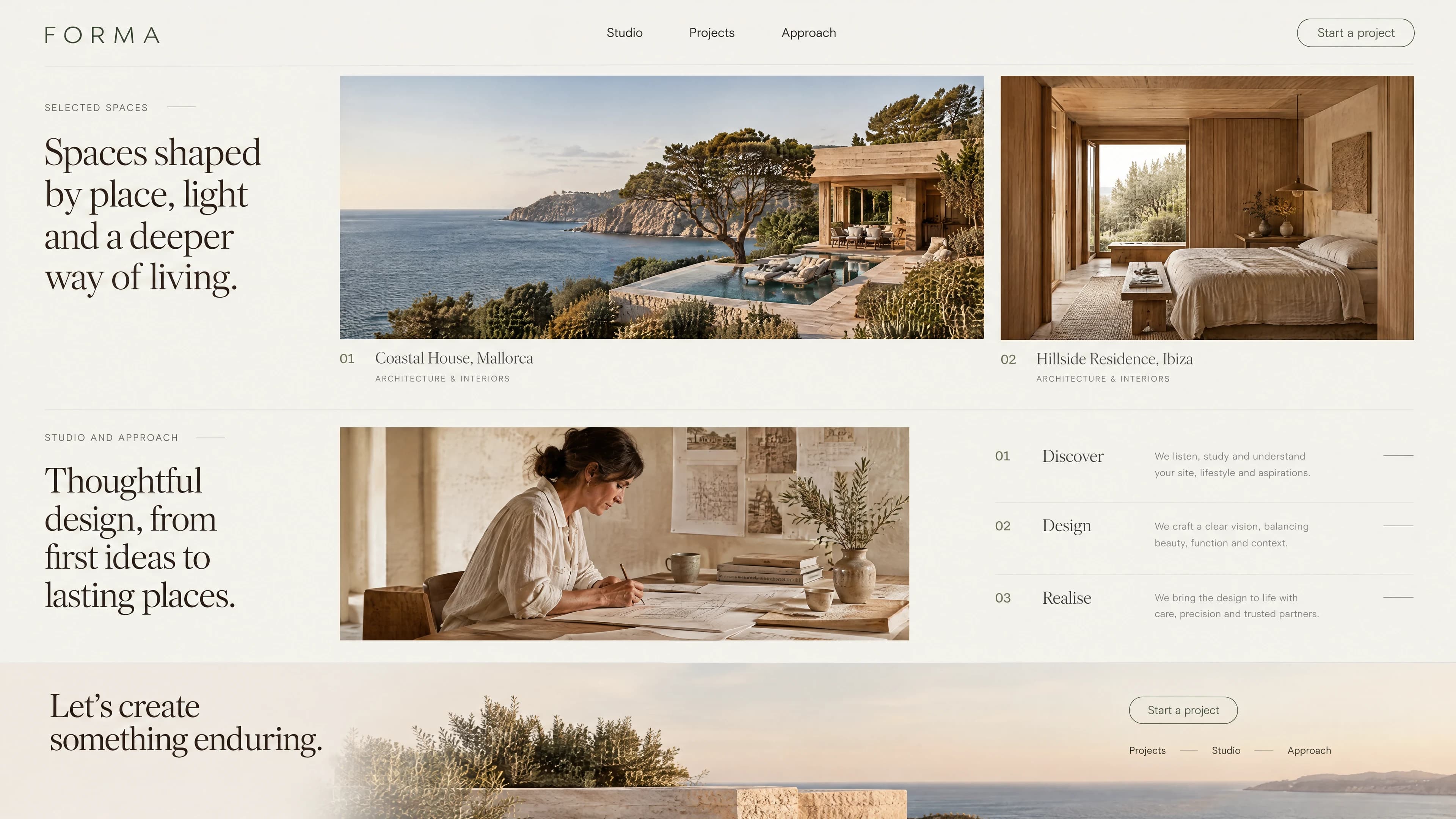
This is how the homepage could lead from a first impression to a relevant enquiry. The sequence is a concept to be refined around your actual content.
A strong architectural image establishes the first impression. A short statement explains the design approach without covering the photograph in copy.
A few projects with location, brief and clear captions lead to detailed project pages. The selection should demonstrate relevant experience.
A short introduction to the team and design process connects the imagery to real contacts. Services are explained where they relate to the work.
A calm contact section asks about the proposal, location and timing. It moves visitors from viewing work to discussing their own project.
02 / The design decisions
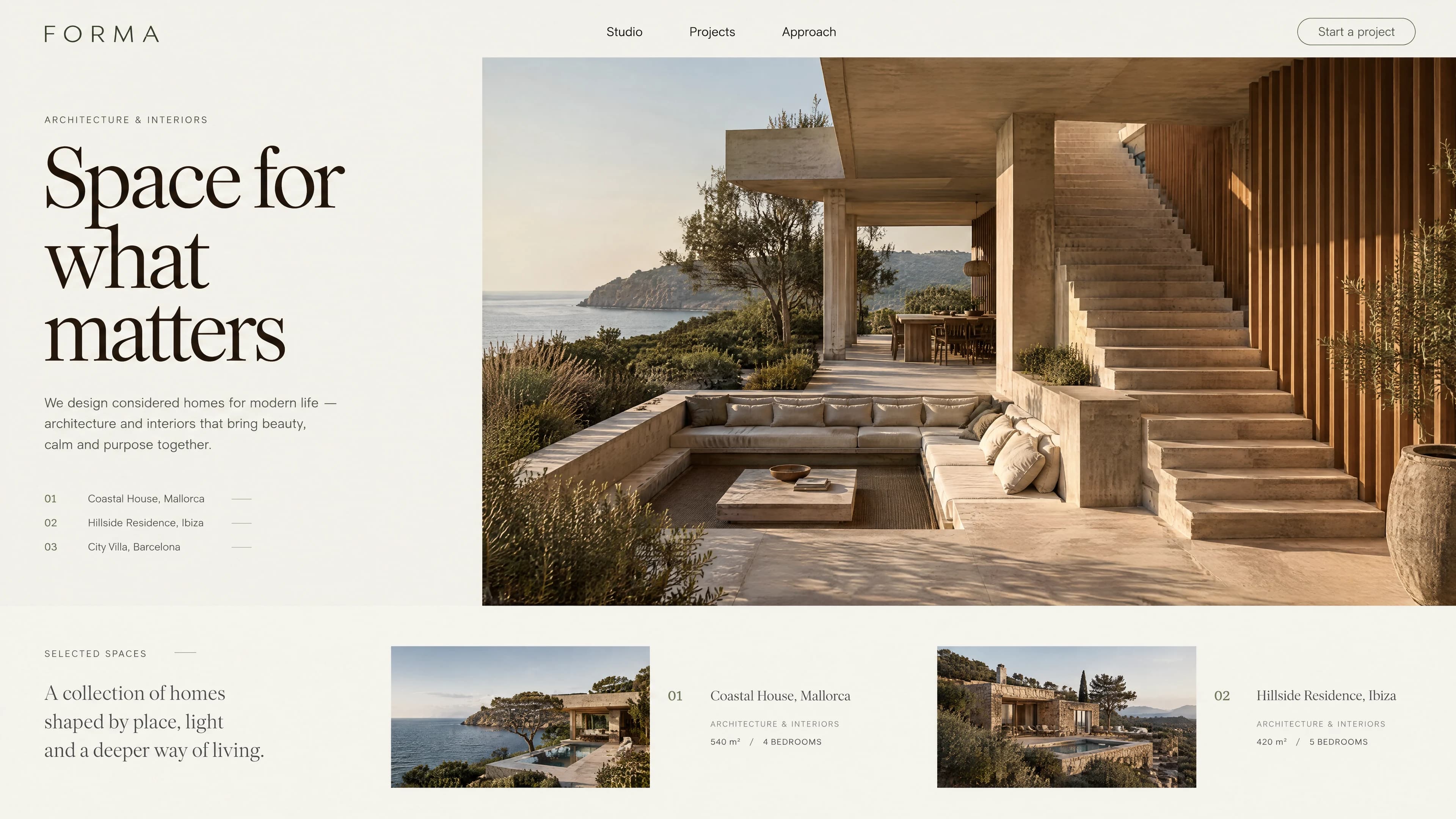
A large residence in limestone and timber, overlooking the sea, defines the composition. The headline and project index sit on a light surface to the left; a small selection below continues the visual story. The buildings shown belong to the fictional image study.
Aa↗
The image study’s high-contrast serif creates an editorial tone. Georgia paired with Outfit would be one possible implementation direction; font selection, licences and exact proportions would be agreed separately.
#e9e5dc#352f28#b9a994#7e8270The title and image can overlap visually without placing text over distracting detail. On narrow devices, readability takes priority over reproducing the desktop composition exactly.
03 / From idea to website
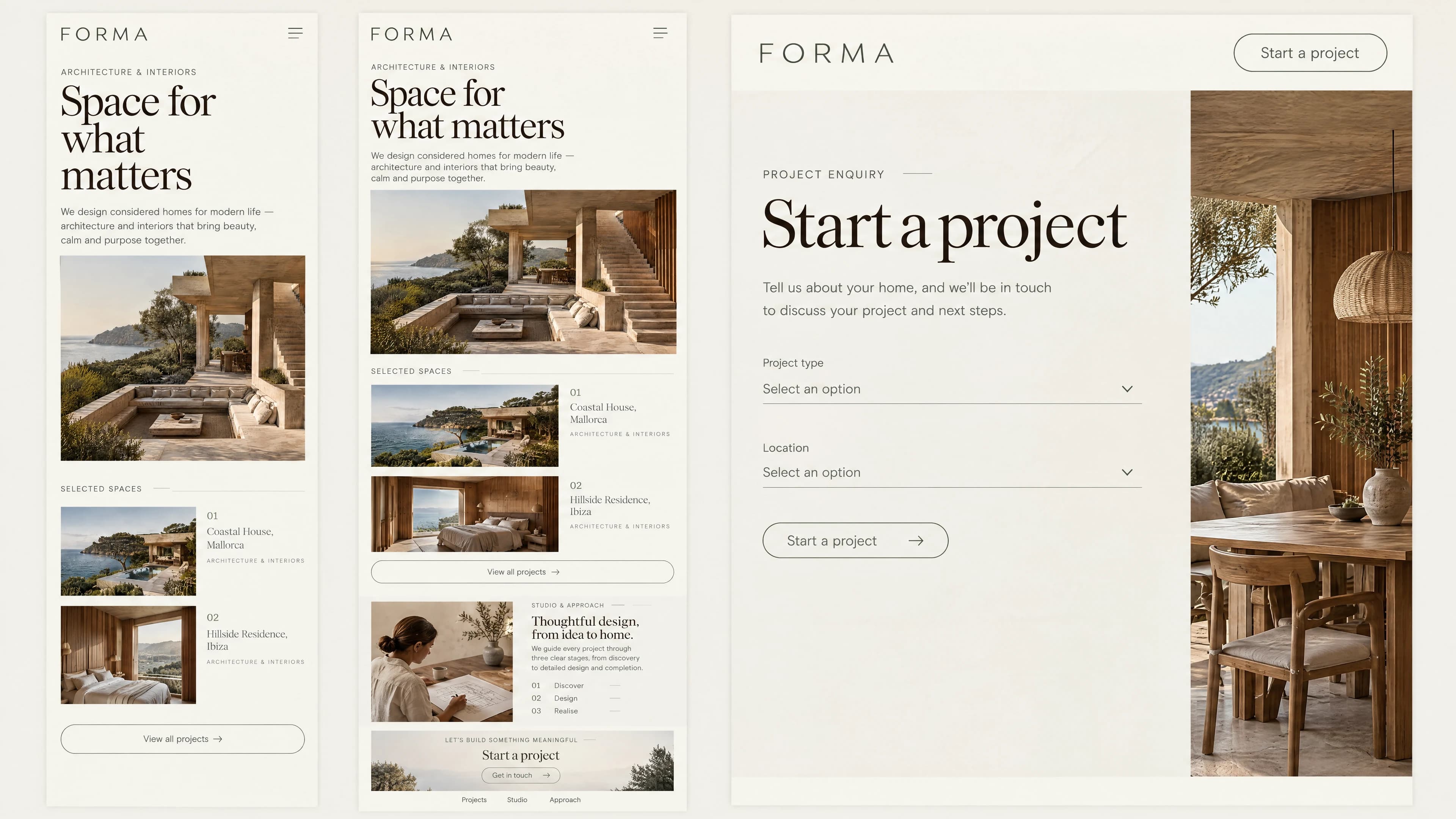
The study presents a calm page structure, image sequence and type hierarchy for a fictional studio. Visitors can explore the concept through the page navigation; the enquiry opens a conversation about their own website project.
A future project sequence could combine plans, photography and material notes. A subtle image transition could work; this quiet design does not need elaborate scrolling effects.
04 / A proposed project process
Define the scope
Outcome: agreed objectives, content and a clearly defined scope.
Review project material, image permissions and the studio’s services.
Map the pages
Outcome: a page map, content sequence and a reviewable enquiry journey.
Plan one representative project page with real copy and captions.
Agree on designs
Outcome: approved desktop and mobile views with agreed type and colour.
Develop the type hierarchy, image sequence and mobile reading order.
Build the site
Outcome: a reviewable staging version with the agreed content and functionality.
Translate approved designs into responsive pages. Bring agreed functionality, content and contact journeys together in a staging version.
Review and launch
Outcome: an agreed release, documented responsibilities and editing guidance.
Check image approvals, the contact journey and editing guidance before launch.
From concept to your website
Let’s discuss your content, the right design and the functionality you actually need. Your enquiry goes directly to Marius Neumann.
Discuss your website project